
Xantrex Website
Role: User Experience Flow Planning, User Interface Design, Information Architecture, Marketing Design
Tools: Figma, Adobe Illustrator, Adobe inDesign, Adobe Photoshop
Project Timeline: 1 year
Team size: 2 designers, 1 developer (agency), render company
Project Summary
I was tasked to lead the development of a new website for Xantrex. The previous Xantrex website was developed in 2010, built on Sitefinity and was very rigid with page design, additions and features. More importantly, it was not designed for mobile and this was a major issue, since 50% of site views originated on a mobile device. The website would also be the template or foundation for all of the parent company subsidiary brands. I worked with a website agency to build a website leveraging Wordpress and Gutenberg.
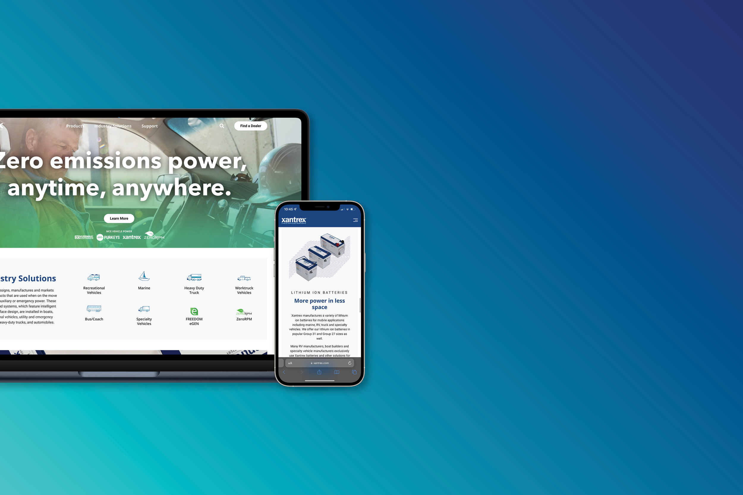
Homepage and sections of a product page.
What is the problem?
Xantrex was utilizing a platform that was 12 years old, outdated and we could no longer add the features we needed to the website. 50% of users were using a mobile device and the existing website was not mobile optimized. The site map of the website had become cumbersome from years of adding pages and menu options, without consideration. Features like Salesforce/Pardot integration, custom calculators and unique landing pages were not an option on the existing site, without a large financial investment. Lastly, the parent company wanted to redevelop all its brand websites and wanted to develop a foundation or template for all brand websites to leverage.
Old website: homepage, product overview, product page and industry solutions.
Solution
Work with a new website agency to develop a Wordpress website that is modular, future proofed, mobile friendly and allows for customization where brands may leverage the website elements, but maintain its unique brand identity.
Context
User Context
Xantrex does not sell direct to customers because of its relationship with dealers and distributors. B2B and B2C customers visit the website for product information, product comparison, application use (what product is ideal for their vehicle), documentation and where to buy the product.
Project Context/Data
Google analytics showed that users drop off once they find the product page they are looking for. 33% of users generally drop off before finding a specific product to look at.
Lead generation was low due to the old website being too cluttered and calling for too much attention. There was the clear opportunity to provide a better user journey and better placement to collect user information.
Site load time was an issue with all the pages and documents uploaded that were never removed.
User research findings:
Users need a mobile website.
Two types of users: super technical, they want to see tech specs (engineers, etc), end user customers who are not technical and need simplified education.
Documents are too hard to find, employees create their own folder of documents, users get frustrated with documents.
Users want to be able to easily compare products and understand the benefits/differences.
Uploading any content to the new website required too many steps and visual changes required HTML.
Sales/tech support/dealers/distributors use the search future to search with part numbers, key feature.
Website is confusing to navigate, menu options are unintuitive.
Functionality and Design
Achieved goals of the website:
Simplified site map and reduced the amount of pages used.
New menu design that is a visual and simplified experience.
Mobile friendly design built in tandem with desktop experience.
Xantrex library created to host all documents in one convenient location
Compare tool created on each product overview page.
Wordpress allows for simplified backend website management.
Integration with Salesforce/Pardot and future plans for custom calculators.
Content redone to cater to specific audience needs.
Homepage
Google analytics showed that click rates of banners in the carosoul after the first banner was 5%. Users were not waiting for the carosoul, so we had to design a homepage that showed users all important information.
Leveraged the homepage to better showcase users products offered by organization
Modular banner design to allow for full customization of homepage banners
Homepage: curated hero banner, modular banners, essential information.
Product Overview Pages
Hero banner – create high quality renders that will be a staple for these pages
Easily updatable product cards
Compare tool that allows users to see a wide variety of product information
Call to action to sign up/contact us
Navigation to documents and videos for product family
Product Overview: 3D rendered hero banners, product cards, compare tool, documents and resources.
Product Pages
Persistent navigation to allow for users to leverage anchors jump throughout page
Content cards to provide important information right away (part numbers, applications, regulatory)
CTA banner
Feature banner section that is dynamic and animated to create a more unique and visual style of presenting features
Dimension images was a key request, since users have such specific space considerations
Tech specs for B2B and technical users to easily leverage
Easy access to all documents, videos and CTA
Product Page: anchored top nav, feature banner, content banners, datasheet integrated on page.
Industry Solutions Pages
Create a proper story for industry solutions
Sales director provided feedback which pages should be catered to B2C vs B2B
Rich visual content (logos, quotes, application images)
Product education blocks
Industry Solutions: sales tool to visualize impact on specific industries.
Navigation
Simplified navigation options
Leverage icons for visual identification
Reduced the overall number of navigation options
Contact Us
Created a clear user journey with 3 options that lead to Pardot/Salesforce forms
Find a Dealer
Created a simplified user experience, where the user may use their location services to find the nearest options
Dealer cards with key information, instead of a long HTML list
Button leads to their Google Maps information
Ideation
I conducted a competitor analysis, where I broke down the pros and cons of competitor websites to better gauge where we had an opportunity to have a competitive advantage. This lead to the realization of a simplified site map, strong use of product renders, a detailed product page and a compare tool for products.
Next I researched general website trends and companies that have a strong web presence and from a wide range of industries. I studied websites such as: Apple, Dometic, Furrion, Clearly, Samsung, Westpaw.
Impact and Next Steps
The website was launched with positive feedback from Xantrex employees and leadership. For the next month, the plan was to collect user feedback from internal and external stakeholders and leverage data from Google Analytics to refine the user experience and content. A heatmap was installed to better analyze user behaviour. A list of additional features were created to better refine the experience including: refined hover states/animations, motion design, calculators and Wordpress block design refinements.
My Work
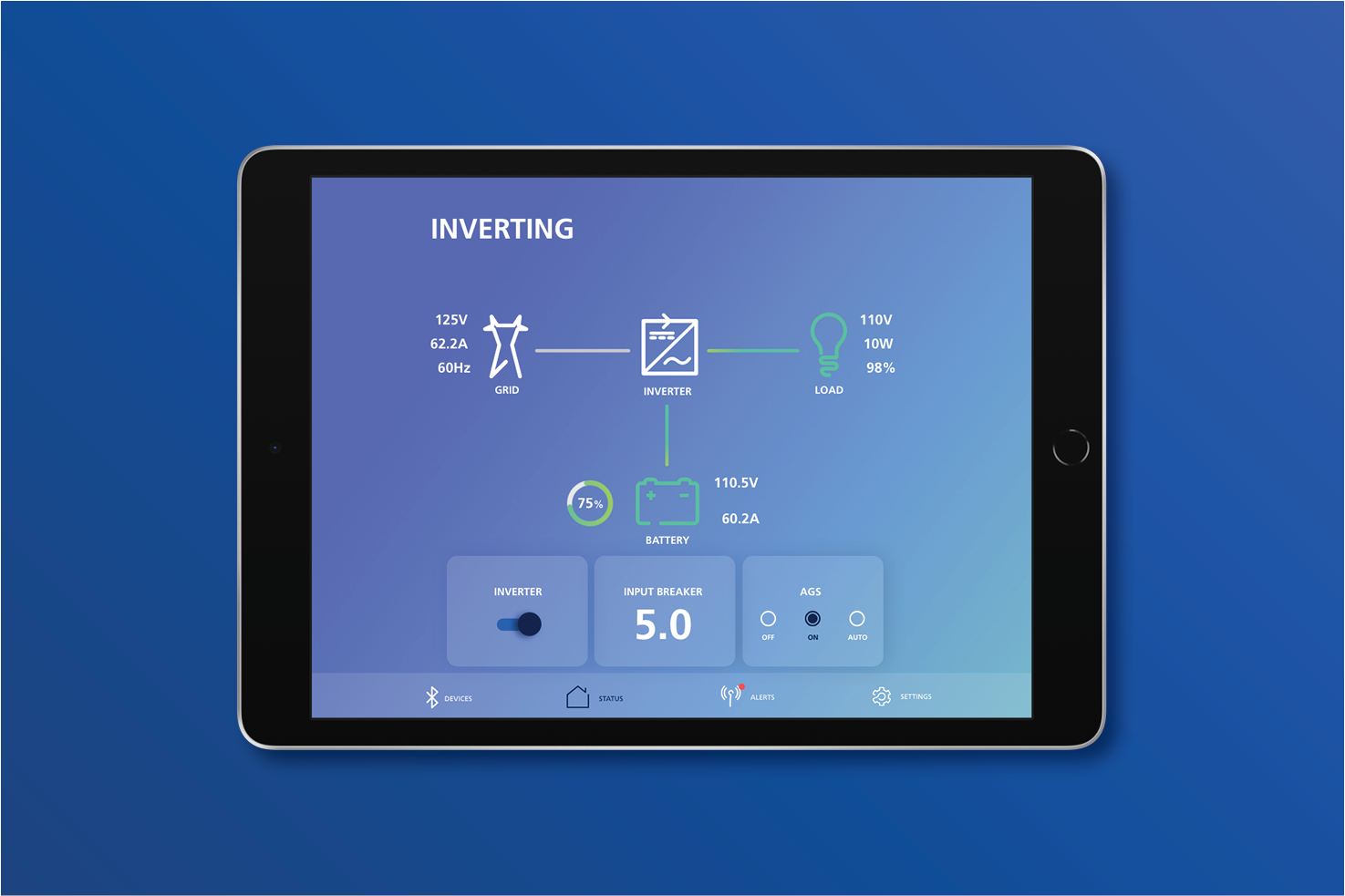
FXC Control App

Xantrex Marketing Material

Instant Marketing Material

@walkwithmax